For this project, I redesigned the Kruidvat product page for beauty products with different color variations.
The Challenge
At Kruidvat, they sell a lot of beauty products. We see many products from one product line with different color variations within the beauty range. How can we entice the customer to put multiple colors of lipsticks in his/her shopping cart?
Must have:
- Providing incentives/enticement to the user to place lipstick in their basket
- Phone web page demo in Figma
Should have:
- An aesthetically pleasing design creates a positive response in people’s brains and leads them to believe the design actually works better. (https://lawsofux.com/aesthetic-usability-effect/)
Won’t have
- Shopping cart pages
- Buy process pages
- Tablet, PC or other device web pages
User research
Key insights from user research.
- Opportunity: The Lipstick Effect. This phenomenon gets its name from the increased lipstick sales during times of economic distress like recessions. Lipstick sales rise during these times as consumers cut back on large purchases and instead splurge on smaller, more affordable luxury items that increase their happiness. (https://mailchimp.com/resources/lipstick-effect/)
- The majority of women own at least 10 lipsticks at any given time and are willing to spend up to $20 on a lipstick purchase (https://salesfuel.com/76-teens-purchasing-lipstick/)
Competitor analysis
Key insights from competitor analysis.
I looked at the Douglas, Bol. and Beauty Bay e-commerce web versions.
- Color indications aside from the photography can be seen on all websites
- A horizontal overview of the colors is also a common practice
- A dropdown menu with color options is what the customer encounters everywhere


Designs
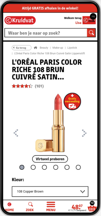
First of all, I designed some low fidelity prototypes of the current website and two possible solutions. This gave me a good feel for the information the user can or cannot see and interact with.
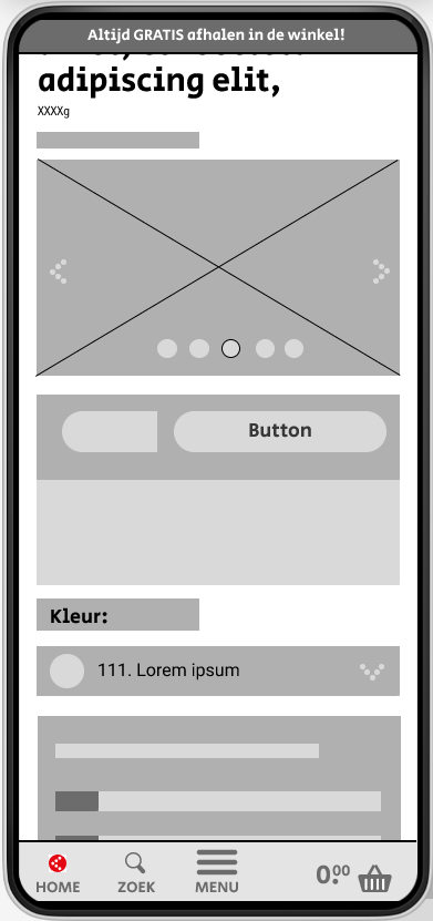
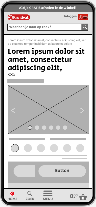
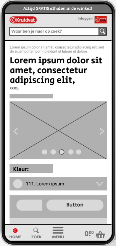
Taking into account the different stakeholders I decided to show three routes to improve on this subject.
Option 1: Quick fix
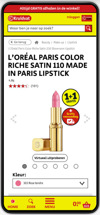
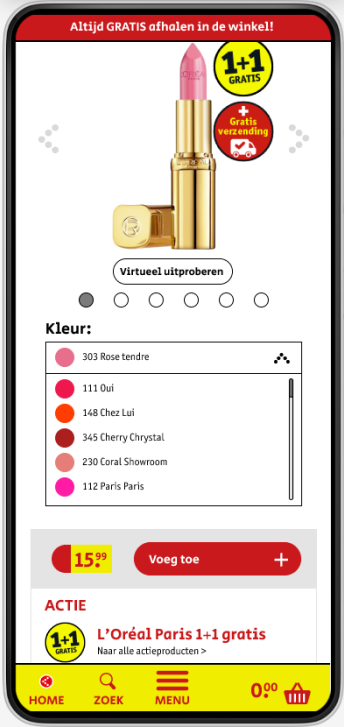
This option consists of adding the color of the lipstick to the existing dropdown menu.
The location of the color choice has also been moved from the bottom to the top of the card with the add-to-basket button (voeg toe). This is done so we can link the color with the photography. Here we are applying the Law of Proximity. Objects that are near, or proximate to each other, tend to be grouped together. Proximity helps users understand and organize information faster and more efficiently. That way the user can quickly try out more lipsticks and decide on the one they want to buy.
Option 2: Competitors
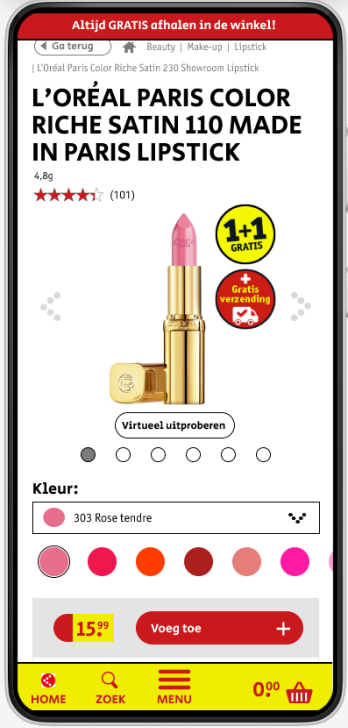
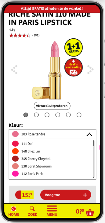
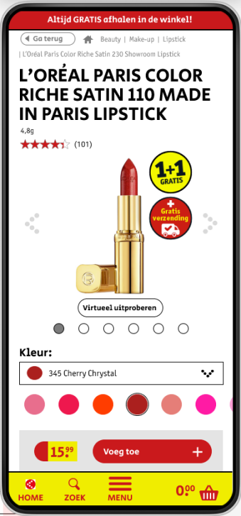
For option 2 I looked at the competitors. Here we also applied the dropdown menu with colors but I added an additional horizontal color bar. We are using existing mental models here. We are applying Jacob’s Law. Users spend most of their time on other sites. This means that users prefer your site to work the same way as all the other sites they already know.
People in general process images faster than text. By having a horizontal bar it takes fewer clicks to switch to a different color. The user also immediately sees more colors they might be interested in.
Option 3: Call to action
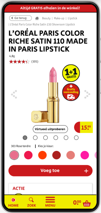
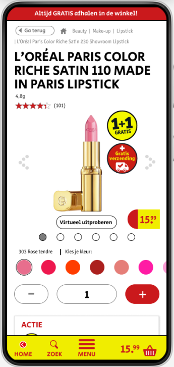
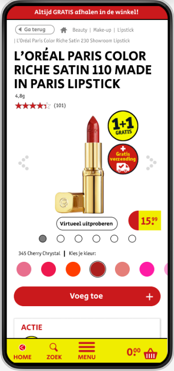
For the last option, I focused on the call the action. What is it we want the customer to do? That is adding lipstick to their basket. We need to make this as easy and accessible as possible. I changed the following things:
- I made the call to action button visible above the fold so it’s always in the view of the customer.
- The most important button/action (add) has a larger red surface and thus stands out more.
- The search bar at the top of the page has been removed so that customers do not leave the page instead of buying the product.
- This version only uses the horizontal color bar and does not have the dropdown. This way you create even more overview on the product page. And the aforementioned benefits still apply.
This however does need to be tested with the customer base because Kruidvat has such a diverse group of customers. Everyone must be able to understand this. If that’s not the case another option might be better.
Depending on the budget and resources of the stakeholders you could improve the product page with one of these options.
My advice would be to apply the changes of option 3.
Learnings
- I think you can apply the call to action principles to more situations. I will take this with me on future projects. I think it’s always important to ask yourself what does the user want to achieve in this moment and how can we make that as easy as possible for them. And don’t be afraid to remove options that deter them from it.
- Sometimes existing mental models might not be your/my preferred way to design things in an esthetic sense but it’s more important the users can focus on their task rather than on learning new models.
Date: May 2024
